
Painting a Bright Orange Accent Wall in Our Bedroom
I don’t know what came over me, but when I moved into my new apartment I felt strongly that we should paint the bedroom orange. Or yellow. Something bright and funky.
In my last bedroom, I painted the wall behind my bed dark blue. I loved the effect it had on the room; your eyes were immediately drawn to the wall, and the rich color made the whole space feel more luxurious. Knowing how transformational a coat of paint can be, I wanted to do it again. But when I arrived at my new place and looked at this bedroom it just didn’t make sense to go with a deep, dark color.
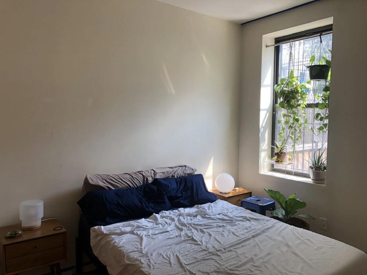
All we had in the room was a bed and two nightstands (which is really all that can fit comfortably), so we were essentially working with a blank canvas — nothing had to match anything else. The room gets flooded with sunlight throughout the day, and as soon as we had the layout in place I felt it: bright is right.
Often, decisions like this go the other way around. I see a photo that inspires me, and then I brainstorm ways to work it into my interior style. But this time I was going with my instinct, and I won’t lie… I wasn’t 100% confident. I have been loving orange lately, but something about it seemed so extreme and I was afraid it would go horribly wrong. I don’t want my bedroom to scream MACARONI N CHEESE, you know? So I headed to Pinterest to see some evidence that other people have pulled this off, too.
Inspirations
Good news! This obnoxious color can be applied tastefully. These are some photos that spoke to me:

I wanted to achieve a 70s feel — but in a good way, not a bad way. You know what I mean by that, right? Here is a good example of a room I would hate to be in:

Kenny was down for the color, too (no Pinterest convincing was needed on his part), so all that was left was to find the right shade and get to work. After doing some color shopping, we settled on Farrow & Ball Dutch Orange. It’s the perfect shade of sunny yellow-orange and so darn cheerful.
(F&B’s high-end, expensive branding was also reassuring to me, like perhaps the decision to paint a room bright orange is something a sophisticated person might do. Their fancy cardstock menu of paint swatches would obviously look chic, not like I was creating my own personal Nickelodeon Studios.)
But first, the other three walls
We decided to do a fresh coat on the neutral walls first and save the orange for last. I spent one night taping everything off, putting spackle in holes, and scrubbing the baseboards with a magic eraser so we could get started right away the next day with a fresh slate.
Of course, there was no way we were going to get through this project without any kinks in the plan. I’ll spare you all of the boring details, but I immediately hated the first coat of white paint we put up on the walls. It was WHITE WHITE; my eyes hurt. The next morning, we cracked the can open to do a second coat and realized why it looked so unbelievably bad. We had received unmixed paint from the hardware store. There was no pigment in it at all.
You can see the difference between the two whites below, and good lord! The first coat was so stark and sterile compared to the second one, a warm-toned neutral shade from Benjamin Moore called Navajo White.

The whole mix-up was so annoying, and to make matters worse, the hardware store didn’t offer me a refund for the bunk can or a discount on the second can. By the time all was said and done, I had spent double the time and money to get this stupid room back to square one. I was happy with the results, but I was already fatigued by the setbacks and we hadn’t even made it to the main event!
Finally, Orange
After the experience with the white paint I felt sore about the money and time we’d lost, and it was driving me bonkers having our bedroom disheveled for so long. This was supposed to be an easy project! Unfortunately, I am both optimistic and impatient, and I always believe things will be easier and quicker than they are. Will I ever learn this life lesson? Most likely no.
Anyway, we went to Farrow & Ball to pick up our Dutch Orange… and it was closed! We checked the hours online, but they were amended due to COVID. It was disappointing, but I didn’t want to wait yet another day to paint (and then ANOTHER day for it to dry, removing the tape, etc) so we pivoted to Lowe’s and looked for samples that were close in color.
When we brought the closest swatch we could find to the paint mixing counter, the person working explained to us that he could color match the F&B swatch we brought in. Amazing! The color really was a true match, and the can was $18 instead of $$$ like Farrow & Ball would have been. It was a really pleasant experience after all of the drama with the unmixed white.
A coat of primer and two layers of orange later, and we were finished.

Here it is in all its vibrant glory. I absolutely love it!
The Nickelodeon blimp and Kraft Mac-N-Cheese fears disappeared completely from my mind once I saw it in the daylight. It looks exactly how I imagined it in my most generous predictions: warm, exotic, and full of personality. 70s, but in a good way.

I’ve been a lifelong renter (so far), and it feels like landlords always go with the same generic off-white color because it’s easy and inoffensive. I don’t hate white walls or anything, but I’ve been surprised at how much I love the colors I’ve painted in my last two apartments. Adding a bright accent wall allows me to put a little bit of my own personal style into the space, even if it’s not mine to keep.
Kenny and I mentioned this endeavor to a friend while it was still in its planning stages, and he predicted that we would get through the bedroom and change our minds about painting the rest of the house.
Well Reader, he was right.
We had large ambitions; we had already picked out a nice sage green for the living room. But I ended this project with the same thought I have every time I paint, maybe next time I’ll hire a professional.